Show table of content Hide table of content
Have you ever glanced at your weather app and wondered about those mysterious yellow bars? You’re not alone. Many smartphone users are just now discovering the true meaning behind these visual indicators, and the revelation is creating quite a stir online. What started as a simple question on Reddit has evolved into a fascinating discussion about how weather apps communicate temperature data.
Decoding the colored bars in your weather forecast
Weather apps have become essential tools for planning our daily activities. Yet despite their widespread use, many features remain misunderstood. The colored bars in particular have left many users scratching their heads. These visual elements aren’t just decorative—they convey important temperature information at a glance.
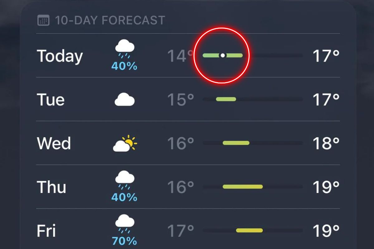
A curious Reddit user recently sparked an online conversation by questioning why temperature bars vary in length despite showing identical temperature ranges. This seemingly simple question about hidden meanings prompted weather enthusiasts to offer explanations. One helpful user clarified that these bars represent temperature ranges relative to the entire 10-day forecast.
For example, if the 10-day forecast shows temperatures from 4°C to 20°C, a day with temperatures between 7°C and 15°C would display a shorter bar positioned within that broader range. This visual representation helps users quickly compare temperature variations across multiple days without focusing on specific numbers.
The color scheme of these bars also carries meaning. Dark blue typically indicates temperatures below freezing (0°C), while light blue represents 0-15°C. As temperatures rise, the colors shift through green (15-20°C), yellow (20-25°C), orange (25-30°C), and finally red for temperatures above 30°C. This intuitive color gradient provides an immediate sense of how warm or cold a day will feel.
How users are reacting to this weather app revelation
The discovery of what these bars truly represent has generated mixed reactions across social media platforms. Some users expressed surprise at having missed such a helpful feature for years. Others praised it as a “nifty feature” that makes temperature trends easier to interpret at a glance.
Not everyone had the same experience, however. Some users wondered why they didn’t have bars in their weather apps at all, highlighting differences between app versions and operating systems. One humorous commenter described the bars as a “visual representation of daily misery”—perhaps an apt description for those in particularly challenging climate zones.
This revelation demonstrates how even widely-used apps can contain features that go unnoticed by millions of users. Finding these subtle differences requires an incredible eye for detail, much like spotting small variations in similar images. Weather app interfaces prioritize simplicity, sometimes at the expense of explaining these useful visual elements.
What’s particularly interesting is how information spreads in today’s connected world. A single post questioning a seemingly minor feature can cascade into thousands learning something new about tools they use daily. This social sharing of knowledge helps users maximize the benefits of technology that might otherwise go unexplored.
Recent updates to weather app functionality
Apple’s iOS 18 introduced significant enhancements to its built-in weather app. Among these improvements is the “Feels Like” temperature feature, which appears when environmental factors create a notable difference between measured temperature and perceived comfort. This addition helps users better prepare for conditions where wind chill or humidity significantly impacts how weather actually feels.
The update also brought personalized weather reports for saved locations. This allows users to quickly check conditions for their home, workplace, or any frequently visited destination without repeated searches. These quality-of-life improvements reflect developers’ understanding that weather apps serve as daily decision-making tools for millions.
Behind these user interface elements lies sophisticated data sourcing. Most weather apps, including Apple’s, draw information from national weather services and meteorological databases. The visual presentation of this data through colored bars and other elements transforms complex datasets into easily digestible information.
Technology miscommunications can sometimes lead to significant misunderstandings in our digital lives. In one extreme case, a woman reportedly sought divorce after an AI tool incorrectly assured her of infidelity in her marriage. While weather app misunderstandings have less dramatic consequences, they demonstrate how important clear communication remains in digital interfaces.
Making the most of your weather app’s visual features
Understanding the visual elements in your weather app can significantly enhance your ability to plan around changing conditions. The colored temperature bars provide a quick, intuitive way to assess upcoming weather patterns without wading through detailed forecasts. By glancing at the length and position of these bars, you can instantly grasp how a day’s temperatures compare to the surrounding week.
Pay attention to the color transitions as well. A forecast showing predominantly blue bars signals a cold period ahead, while yellow and orange indicators suggest warmer days perfect for outdoor activities. These visual cues work together with numerical data to give you a more complete picture of upcoming weather trends.
Weather apps continue evolving with each update, introducing new features that make meteorological information more accessible. Taking a few minutes to explore your app’s interface might reveal helpful tools you’ve been overlooking. The next time you check your forecast, notice how the colored bars enhance your understanding of temperature patterns—you might find yourself appreciating this formerly mysterious feature.


